Yellow Peril Zine
Print & Layout Design
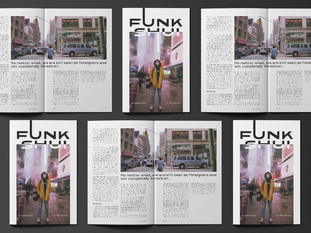
The Yellow Peril zine is a piece centered around anti-Asian sentiment in the United States. All typefaces were created by Asian type foundries to connect to the zine on a level deeper than aesthetics. All photos were taken in Chinatown, NYC using a Fuji-film disposable camera to create a personal tone depicting a part of the city where Asian Americans have historically come together to live.
The feature story interviews my friend Tiffany—an Asian woman living who has lived in the city all her life—and uses a dark green film grain background, referencing the green hue created by developing extremely dark photos. The hand-drawn typeface is also meant to create an intimate and nostalgic feeling, showing that the issue of racism is something personal to many.
Page layout sketches
Back to Top